A Modern Sense of Motion
Towards the end of last year, I was given a wonderful opportunity to work on a new lesson with my 5th grade students Scholastic Art Magazine. Among a few options, I chose to focus my lesson on the Armory Show of 1913 and its influence on the
 American perspective of modern art. How exciting!
The lesson focused on the featured artist, who shocked the nation with his innovative and striking representation of a nude descending a staircase...Marcel Duchamp.
The goal of the lesson was for my students to gain a greater understanding of the various transformations art and art making throughout the art history timeline, that influences and challenges our perspectives on art and beauty.
For this to happen, I first created a platform for discovery and discussion. I couldn't, simply, throw Duchamp's Nude Descending a Staircase, No2, on the board and say "This is what Duchamp did, let's do the same".
That was not the goal.
The goal was for my students to gain a new perspective on looking, thinking and making art, and that requires some new information. And, I had to answer my own question, "How do I encourage my students to see in a different way?"
My answer was based on my response to why the Duchamp's painting and the Armory Show of 1913 was so shocking. What happened?
Something "new" happened. The Armory Show challenged the American viewers' perspective and questioned their ideas. And, that was shocking.
To really have my students understand this transformation, we looked at what American artists and viewers were accustomed to and what was presented to them in 1913, ending with Duchamp's painting.
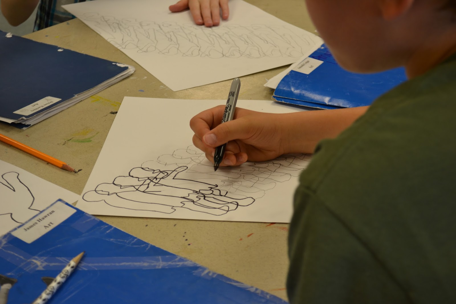
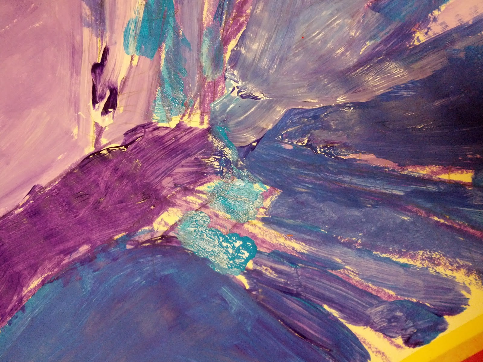
While working through our own descending portraits, we focused our efforts on capturing motion through the use of overlapping, repetition and value. The combination of these elements helped my students achieve a sense of motion in their mixed-media art work.
Click on the "Hand-On Link" link for the complete lesson!


It was an awesome lesson that really engaged my students.
To be honest, the overlapping lines drove them a little crazy but the end results were really wonderful.
Check out
http://art.scholastic.com/
for additional tips, lessons and teacher resources!
xoxo, SMocK you.


,+1912.+www.uncg.edu+nude_no2.jpg)


